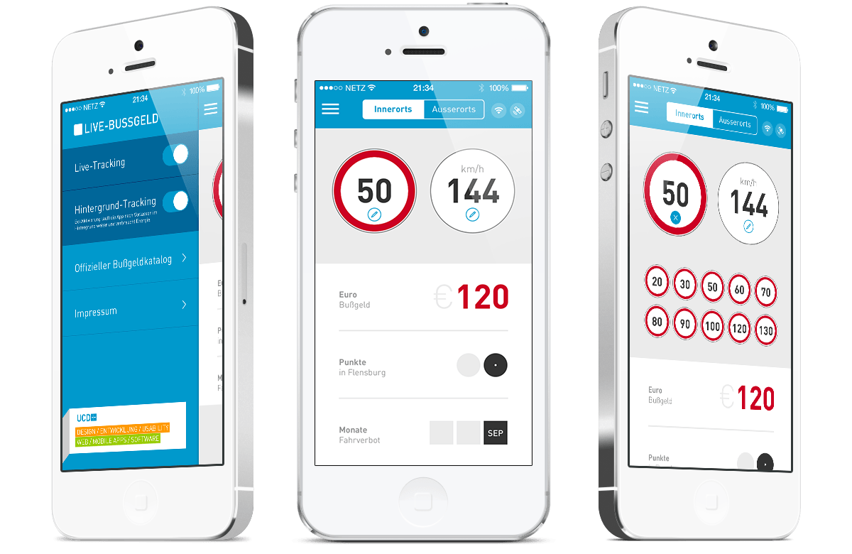
The app tracks your current location and checks the speed limit for that place in a data base. Combined with the official schedule of fines, it calculates the penalty. This all happens live, while you are driving.
The left traffic sign shown in the GUI displays the speed limit for the detected location. The number in the right circle displays the current speed. At the bottom, the app shows the penalties: fine, traffic violation points and month of driver’s license suspension.


That’s nearly all – plain and simple. But user feedback, collected from the first versions of the app, showed the need for more functionality. Since this thing is a “Rechner” (calculator), we added the possibility to really calculate penalties, even if you are not driving.
The user can tap the left and right traffic sign / circle and enter manual values, to see what the penalties would be.


After helping shape the concept, interactions and flows, I defined the visual style of the app. Since the app is an internal UCD+ product, it uses basic visual elements of the agency, like the typeface DIN, colors and overall simplicity.
Speed limits are shown in typical traffic sign style. All other elements are reduced to pure information, with as little decoration as possible – just color-coded numbers, circles and squares.

The app runs cross-platform on iOS, Android and Windows Phone. All sizes and margins are defined in a relative way and all main elements share the same visual style across platforms.
Just specific UI-elements, like the tabs at the top, are based on the OS, that the app runs on to make the user feel at home.


After testing different metaphors for the app icon, a speedometer and speed limit traffic sign were used. I defined different style variants and one of those was chosen, based on a test. In the end I produced several different sizes of the icon for iOS, Android and Windows Phone.
